Interior Design in Films
By:
Neysia Novaristia (2502000123), Gregorius Diaz Deiva (2540129275), Sophia Valmaiswari (2502002381), Vinsen Fernando (2540124766)
Many of us obviously watch films to be swept by the characters and their storylines, but it is not rare that we find ourselves distracted by the interiors and set design. Interiors are the unknown protagonists of most great movies. Often times, unless they’re large productions like “The Great Gatsby” or “Marie Antoinette,” a film’s design goes uncelebrated. Sets are excellent studies for interior inspiration: they’re designed to appear as though they are actually inhabited, rather than picture-perfect renditions for the camera. Furthermore, their lived-in look can evoke a certain mood that reflects the film’s particular disposition. In this article we will be talking about 6 films in which the interiors, become the center of several scenes.
- Parasite
Parasite is one of the movies that is very interior centered to the point that the set itself tells much of the storyline. Since the release, Bong Joon Ho has created a conversation around the emphasis of architecture and interior spaces in movies. This particular film does an excellent job of blurring the boundaries between the two disciplinary fields, to the point where the architecture is not just the background of the set, but it has been placed at the forefront of the storyline, and takes on the lead. First, the film takes us to the Kims’, where a father, mother, and college-age brother and sister live together in a semi–basement apartment. Bong says he chose this kind of home, for them because it is realistic, but also because “it really reflects the psyche of the Kim family,” he tells Architectural Digest through a translator. “You’re still half overground, so there’s this hope and this sense that you still have access to sunlight and you haven’t completely fallen to the basement yet. It’s this weird mixture of hope and this fear that you can fall even lower. I think that really corresponds to how the protagonists feel.”
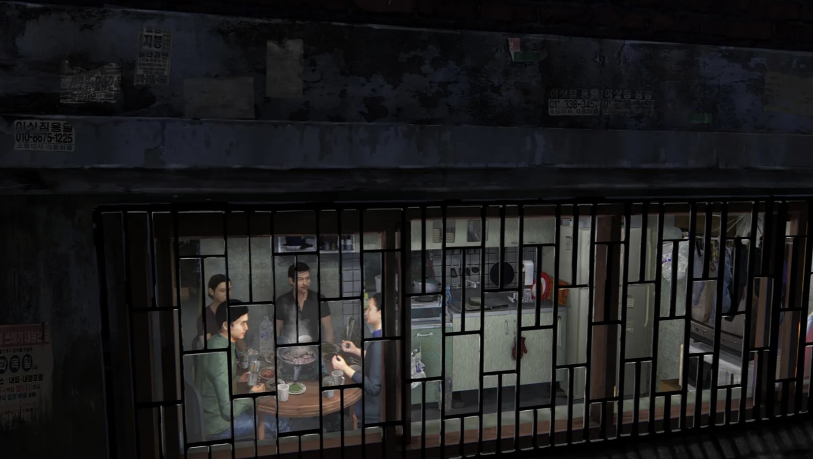
To perfect the work, production designer Lee Ha Jun visited and photographed empty towns that were set to be torn down, and then copied them as he built the Kim family’s crowded street and cramped, cluttered apartment on a set. “I could see the traces of people who lived there,” “We even modeled the old bricks used in the empty houses in silicon to re-create them.”
Eventually, the wealthy Park family is introduced, and their house is the center of the action for most of the film. Like how the semi-basement apartment reflects the Kims’ standing in society, their sleek, modern dwelling reflects theirs. “They want to show off that they have this sophisticated taste,” says Bong. The first floor and garden were built in an empty lot; the second floor and basement were built on a soundstage. This is a film with plenty of secrets and much sneaking around, so some design choices were made with simple logistics in mind—if one character is creeping down the stairs, can the character sitting at the dining room table see them? Aesthetically, though, the goal was to create the sort of house an avaricious, elitist owner would brag about.
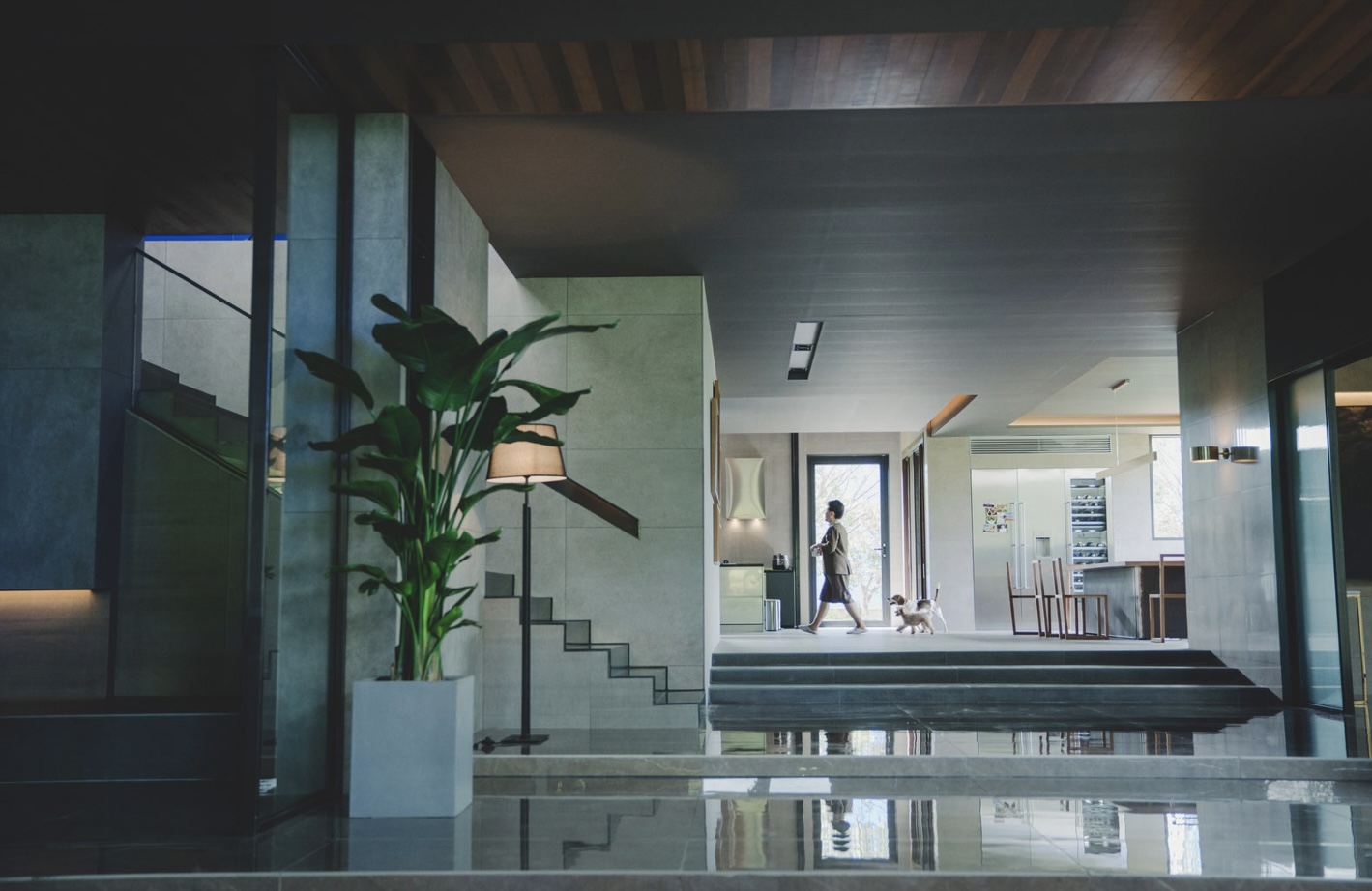
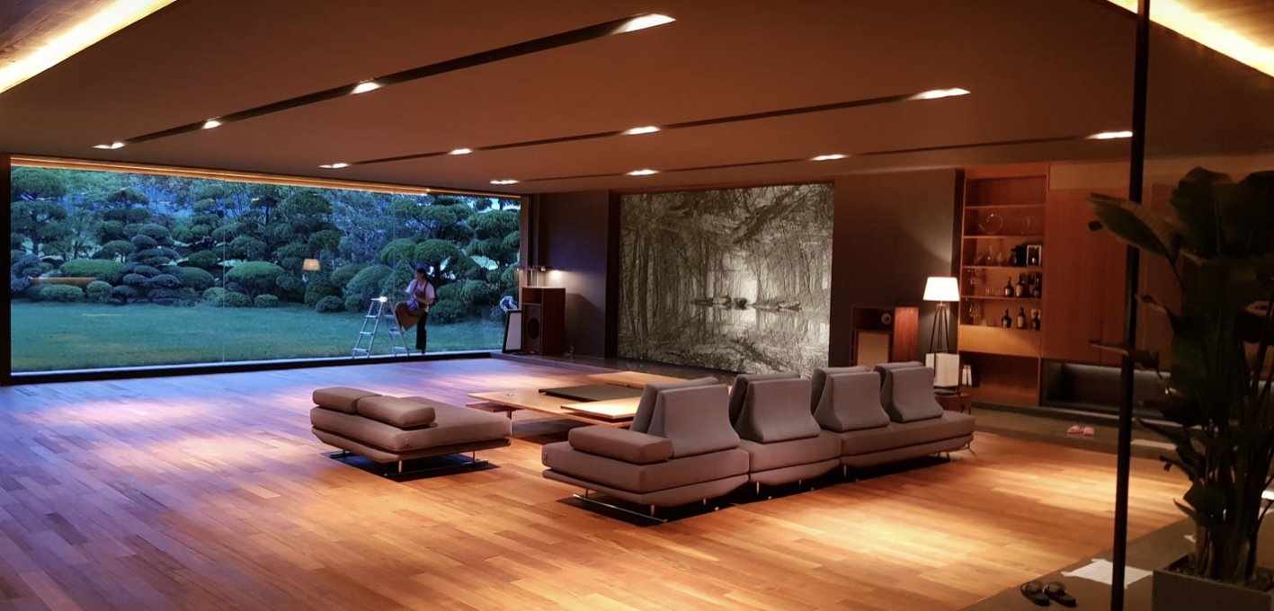
Not only was their home designed by a fictional starchitect named Namgoong, he was actually the previous owner. So to create the set, Lee tried to think less like a production designer and more like an architect. “We had to consider the cinematic factors but also had to create a house so real that the audience could accept the idea the characters were actually living in it,” he says. The result is simple, elegant, and modern with plenty of wood, glass, and clean lines and silhouettes. “When Namgoong built the Park house, the purpose of the first floor living room was to appreciate the garden,” according to director Bong, explains Lee. So the designer gave the space a giant wall of glass looking out at the yard, and outfitted it with minimal furniture save for a unique, multi-level coffee table and a stylish couch. (No television in sight!) “I wanted the wide living room and the large garden to look like one impressive picture,” he says.
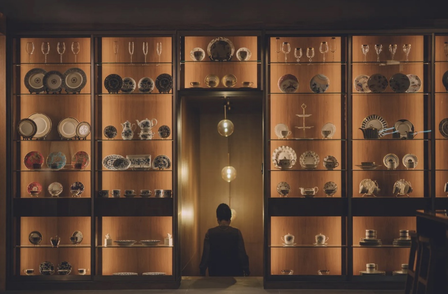
The Parks’ living space does much more than simply provide pitch-perfect characterization. Something dark is lurking in the home, something that drives the plot to a completely unexpected place. Their chic, tastefully furnished, perfectly lit house sets the stage so for the epic twist so well, says Bong, “because houses usually should feel very mundane, cozy, and comfortable. And when that is threatened, that is when we feel the most fear.”
- The Grand Budapest
The story of the Grand Budapest Hotel is set over three different decades, each with its own unique style, colors and film aspect ratio. In the centre, is the magnificent hotel itself, a Art Nouveau designed pink (later orange) palace containing every creature comforts a gentle-person could possible desire. Standing in for the Grand Budapest Hotel is an abandoned department store in Görlitz, Germany called Görlitzer Warenhaus. The crew found the location while scouting for the movie and promptly fell in love with its unique, historical architecture, grand staircases and open floor plan. It was built circa 1912 as department store and functioned as that until 2009, when it was deemed no longer profitable. There are however plans to restore it back as a department store, which according to Wikipedia is set to happen sometime in 2016.

For the scenes in the lobby of the Grand Budapest Hotel, the old department store doubled up for two decades. The production designer Adam Stockhausen and his team built two complete sets in the atrium (diagrams at the bottom), where the lobby of the Hotel was erected. One for the 1920s timeline and another for the shots taking place in 1968 after the hotel is drastically changed to match the somewhat gloomy post-WWII eastern European architecture and design. They way they achieved this is that they first built the set for the 1920s version and then wrapped the smaller 1960s version inside it. When filming was completed for this decade, they simply peeled away the layers no longer needed, revealing a large, grandiose and visually impressive set, restoring the Grand Budapest Hotel to its full splendor.
Anderson credits the Library of Congress’s Photochrome Prints Collection from the 1920s and ’30s as a huge inspiration for the movie. The production team designed the sets with ideas from these prints and from various historic landmarks across Eastern Europe. Inspirations for set designs also came from spas and hotels in Germany and the Czech Republic. Below are a bunch of images from the 1968 version of the Grand Budapest Hotel which displays the ultra symmetrical full-on orange and brown colored version of the lobby.

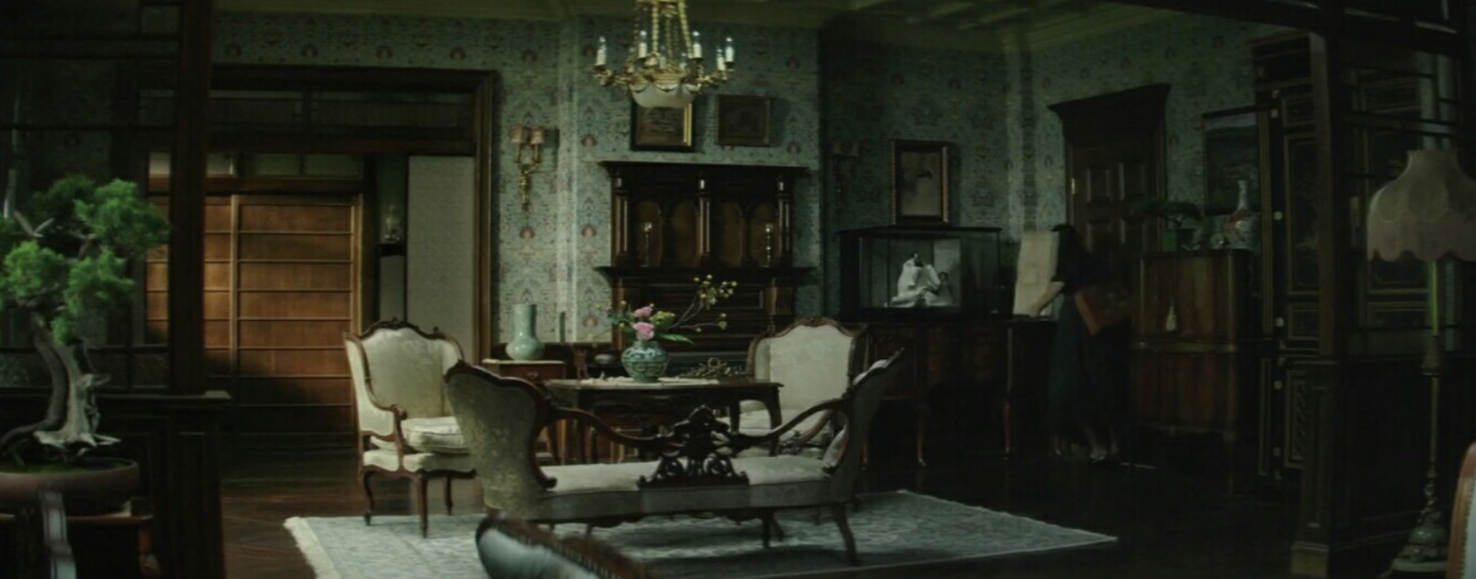
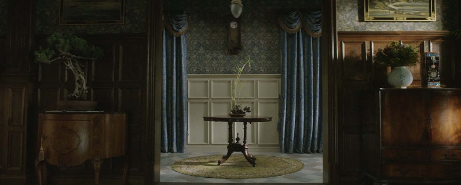
- American Psycho
Designing the home of Patrick Bateman fell to set designer Jeanne Develle and production designer Gideon Ponte, who used a mixture of tones and carefully selected art and furniture to create an environment fit for an ego-centric psychopath. Having said this, the sleek minimalist look of Bateman’s apartment continues to inspire interior designers, collectors, and hipsters nearly two decades later, without the lunatic association of course.
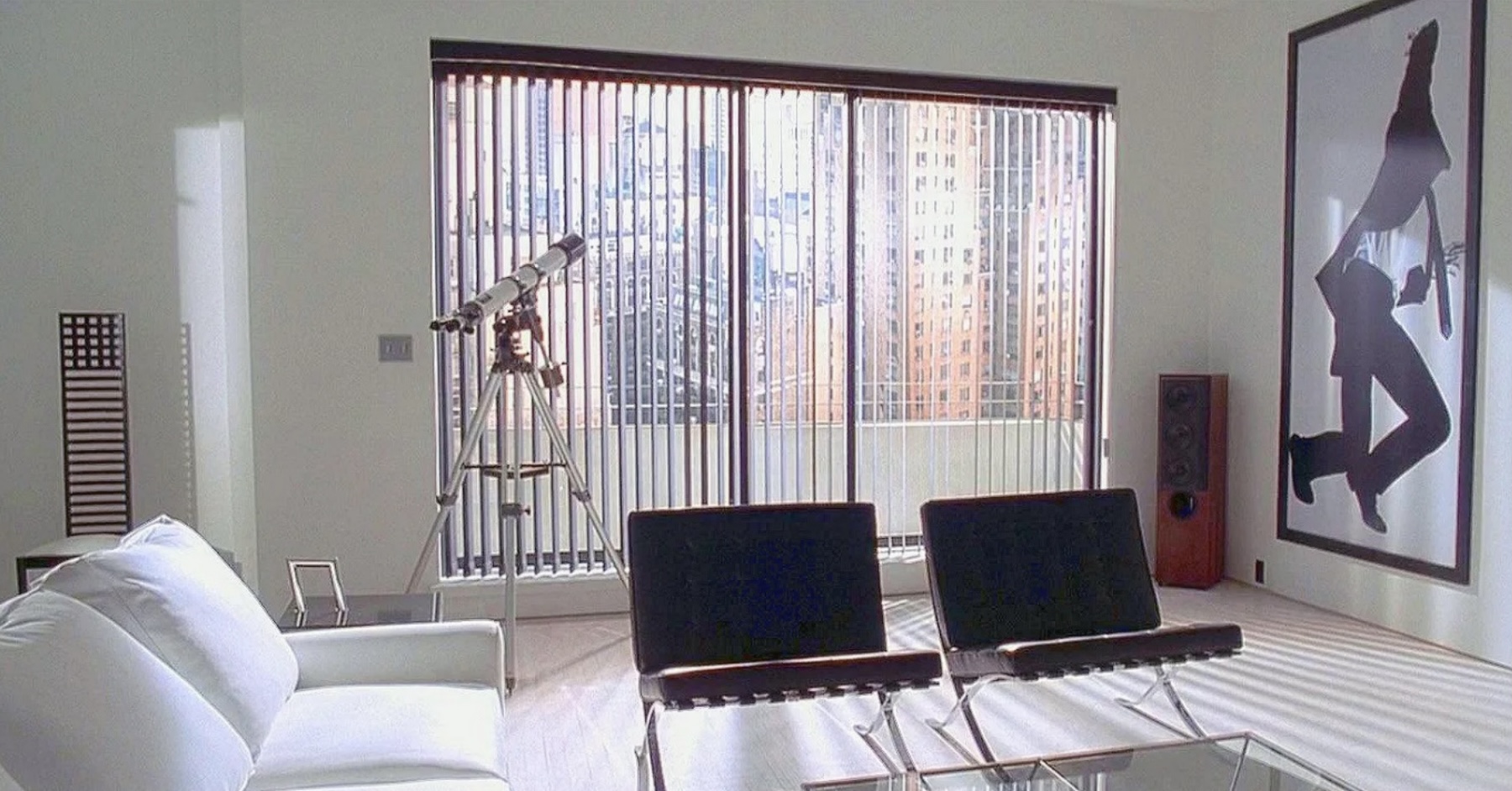
The carefully planned apartment is filled with designer furniture from all over the world. We see a chair from Charles Rennie Mackintosh’s Hill House against stencilled walls, showing what a standalone piece of design the Hill House chair really is. Ludwig Mies van der Rohe was a rising figure of the modernist movement so it’s not surprising that his iconic Barcelona chair, one of the most recognised objects of the last century, was granted a central spot in the American Psycho apartment. Smack bang in the middle of Bateman’s living room is the Alanda coffee table, designed by Paolo Piva for B&B Italia, a true statement to 80s sophistication and style.
The apartment walls reveal an impressive art collection that was a particular focal point for production designer Gideon Ponte, who had worked in New York art galleries during the period the film was set. The drawings either side of Bateman’s music system were from American painter and sculptor Robert Longo’sfascinating ‘Men in the Cities’ series, which depict sharply dressed corporates writhing in contorted emotion, again a subtle reference to the unhinged character’s mental state.
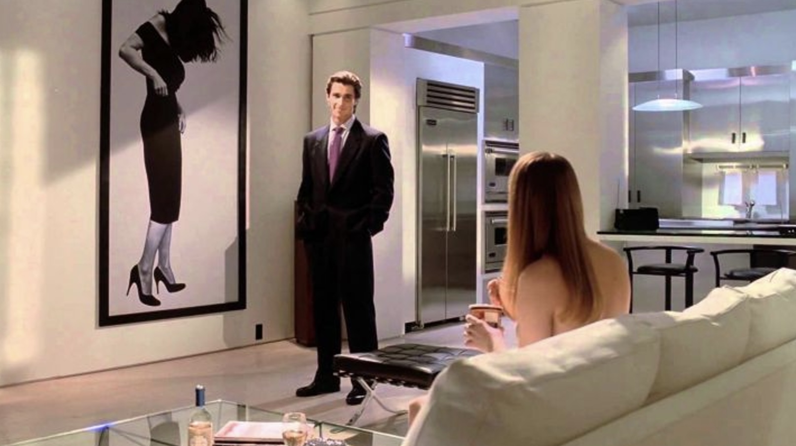
The quality of design is enhanced by lots of empty spaces, sparingly punctuated by colorless furniture in stark black and white, a theme that purposely runs through the apartment. Nothing in the apartment really screams comfort, from the furniture to the stainless-steel kitchen with its sharp corners and grating angles. The films satire rests heavily on materialism and superficiality, in true essence this is the ultimate bachelor pad, however cold and calculating it is equally stylish and enviable. It’s interiors like this, brimming with iconic furniture, that stick in our memories well after the credits roll.
- The Handmaiden

A period drama, two cultures and an erotic romance, The Handmaiden seems like the basis for a captivating set and this is exactly what director, Chan-wook Park, and production designer, Seong-hie Ryu, accomplished. Every scene in The Handmaiden is a showpiece of stunning production design: ravishing décors, detailed settings and luxuriant costumes.
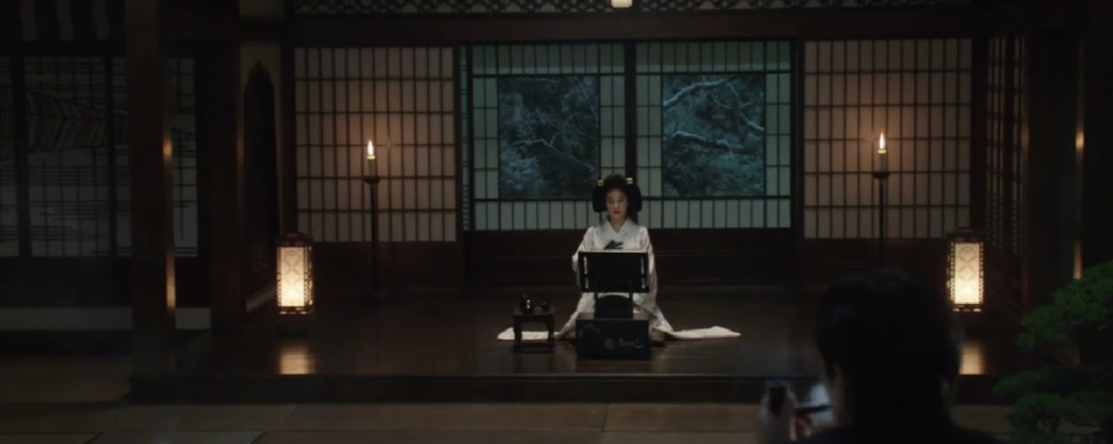
The film is based on Sarah Waters‘ best seller novel, Fingersmith, set in 19th century London. When asked why he chose to relocate the story from Victorian England to colonial era of the 1930s in Japanese occupied Korea, Park admitted that he wanted that, just as in the novel, the story be set in a time where there was still the idea of “difference” and the idea of a modern mental institute.
In Korean history, the 1930s colonial time was the only period in which the class system was still very much part The theme of “difference” is central to the story. Nothing would ordinarily bring the two main characters together. In fact everything separate them; social class, culture, age and personality. One appears absent and naive while the other is burst of youthful energy. Park admitted, that having one character Japanese and the other Korean, added a layer of difference because they come from two different cultures.of society.“Not even in Japan can you find a home that combines Western and Japanese styles”.
The house is an important space in film and could easily be considered as a character on its own. It first reflects Kouzuki’s admiration for Japan and England. It is also an accessory to further widen the space between Hideko and Sookee. Hideko lives on the western wing and therefore lives and sleeps as a western lady while Sookee lives in the Japanese wing and sleeps in a “oshiire”, a linen closet. According to Park, the most important room of the house is the library. Its exterior has a traditional Japanese architecture while the interior has more of a western style. The inside also includes a Japanese garden with tatami mats. Japanese gardens are meant to reproduce the outside world in miniature and represents Kouzuki’s will to create a new world inside his own kingdom. From Japanese traditional costume to romantic English attire, through shoji screens to gothic corridors, a dazzling setting for the many many twisted subplots of The Handmaiden.
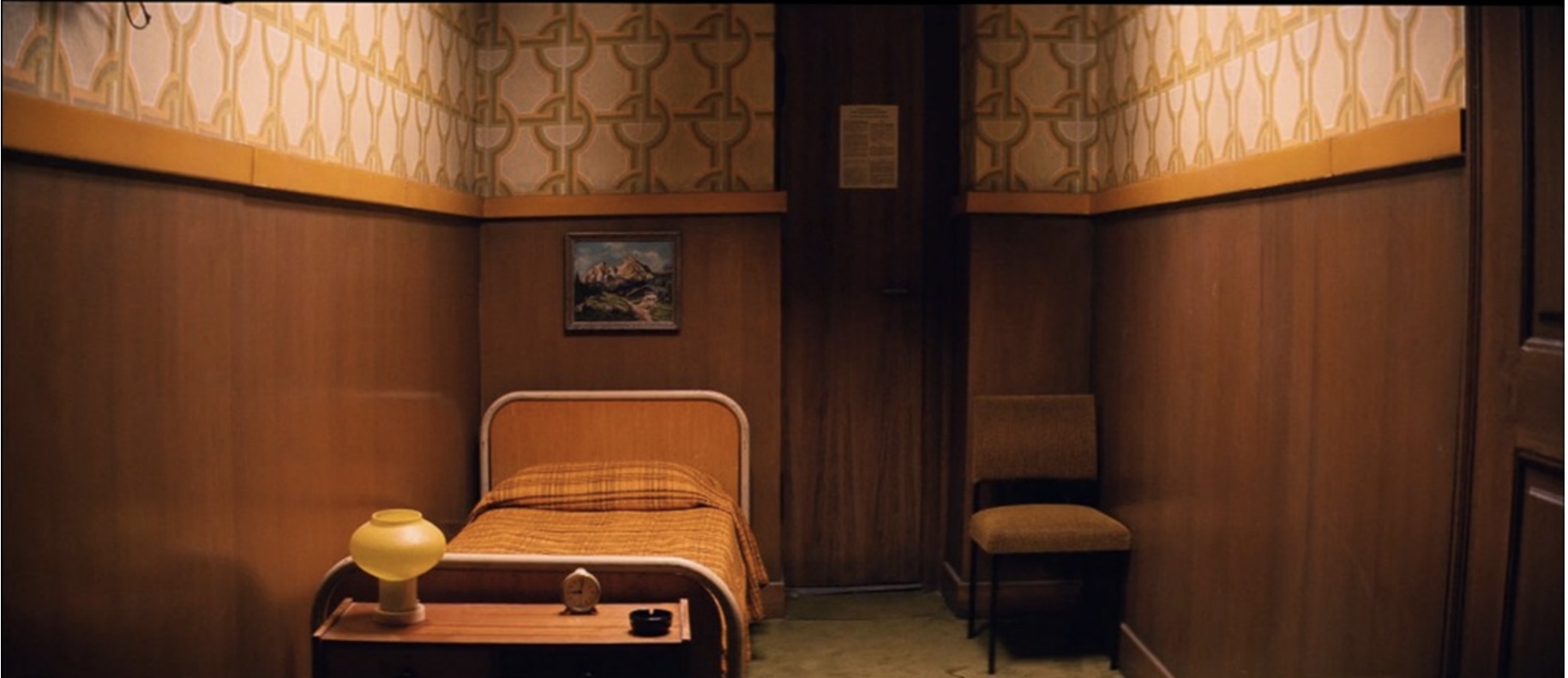
- A Clockwork Orange
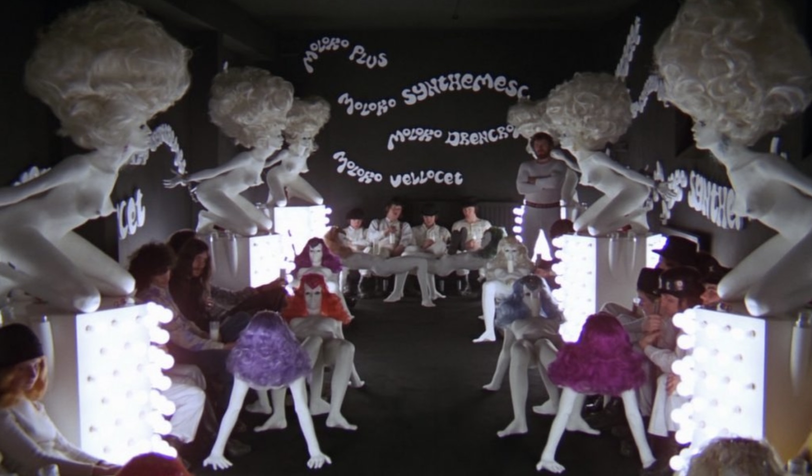
Production designer John Barry was an architect with experience in stage design and entered the film business as a draughtsman on the epic Elizabeth Taylor film Cleopatra in 1963. Later he became production designer on the Clint Eastwood action film Kelly’s Heroes in 1970. Barry was offered the job of designer by Kubrick for his never-completed film Napoleon but hired him again as production designer on A Clockwork Orange. George Lucas also hired him as production designer for Star Wars for which he received the Academy Award for Best Art Direction.
The hyper-stylised film sets and furniture of A Clockwork Orange tell a story in their own right, acting as signifiers which portray a parallel narrative. Coincidentally, many of the pieces touch upon many of my personal interests: From mid century and retro-futuristic interior design and space age furniture, to Pop artists such as Allen Jones, Herman Makkink, Cornelious Makkink and to record sleeve/product designer Roger Dean. All sit together to create an unsettling atmosphere and combine the fantastic with the obscene.
What makes it all the more disturbing is the set design and locations are recognisable enough to tell us the film is set in the near future – not so far away that it feels beyond our own realm, but a future just around the corner. Together with the costumes by Milena Canonero and the electrified, classical score by Walter (later Wendy) Carlos, the production design tells us this is a reimagining of what the present might be – should we not heed the themes of the story.
Kubrick and Barry would have worked very closely to achieve a look and feel which assaults the senses and is another example of how Kubrick uses a characters surroundings to echo their inner world. The film examines the nature of free will, of good and evil, of (almost cartoon) violence and throws it all in our face with velocity – starting with the opening title sequence of bright, brash full screen colours and the first scene of the Korova Milk Bar (one of the few constructed sets).
The exterior of ‘HOME’ is a Paul Litchfield design called The Japanese Garden in Shipton-under-Wychwood in Oxfordshire. The raked pebble garden was part modeled after the Ryoan-ji zen temple garden (Temple of the Dragon at Peace).
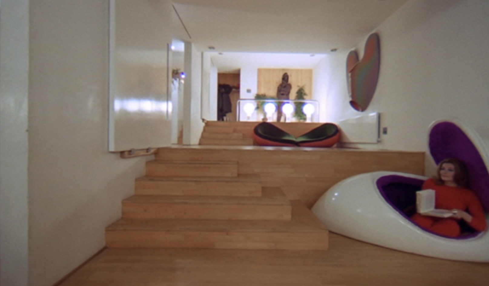
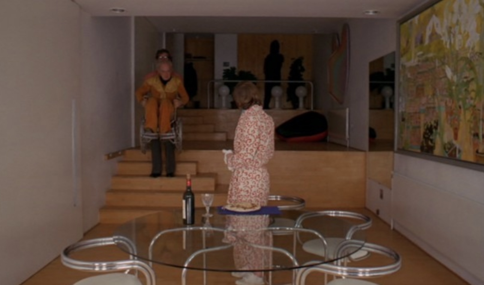
The interiors were shot somewhere else altogether – at Skybreak, Radlett, Hertfordshire – a home designed in 1965-1966 by a group of architects called Team 4. Within the four walls of this outstanding yet somewhat clinical architectural space, Alex and his Droogs reap havoc, attacking and paralysing Frank Alexander (Patrick Magee) and raping his wife (Adrienne Corri) all whilst Alex sings ‘Singin’ In The Rain’.
The rest of this open plan house is divided by stairs and tiers of different heights, and displays carefully placed ultra modern, space-age 60s furniture, almost like a museum. The obsession with space age furniture was fuelled by the space race – we landed on the moon two years previous to A Clockwork Orange‘s release in 1969 and one year before 2001: A Space Odyssey.

It is the film set decoration and production design of these rooms which stick so strongly in the mind. The excess of loud, erotic, often obscene, art, sculptures and decor suggest that in the future we may become desensitised, which both Burgess and Kubrick predicted with some degree of accuracy.
- The Help
Taking place in 1963, Jackson, Mississippi, this movie was an embodiment of hope and forgiveness. The task of creating the worlds of Skeeter, Celia, Hilly, Elizabeth and Abileen fell to the film’s production designer, Mark Ricker, who credits the book Under Live Oaks by Caroline Seeebohm and Peter Woloszynski (along with old copies of Better Homes and Gardens) as a primary influence. While the book and script were natural starting points, the designer of such films as The Nanny Diaries and Julie & Julia looked to a familiar Southern film for inspiration. “I couldn’t begin this film without looking again at Gone with the Wind,” he says.
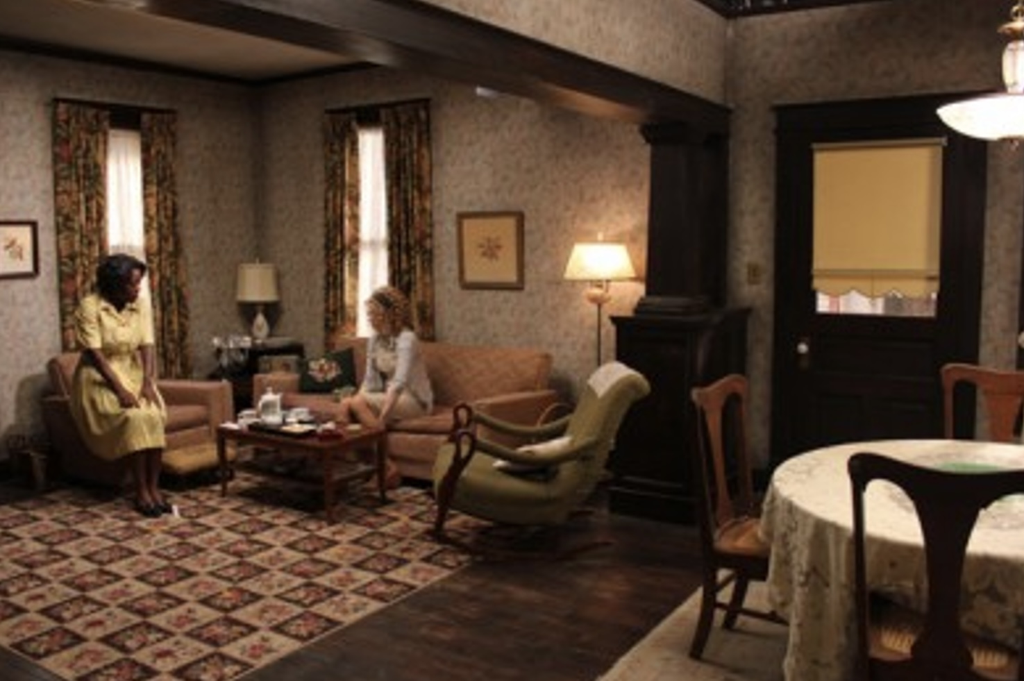
The main houses of the five characters were shot in Greenwood, representing an amalgam of styles that “spanned the spectrum of Southern architecture,” explains Ricker. Skeeter’s house was a classic, white-columned antebellum mansion (“it was exactly as I imagined it in the book”), while Celia’s house was a pre-Civil War hotel converted into a private home and Elizabeth’s was a typical middle-income ranch style.

“It was my challenge to give each house its own personality that supported the characters in the film,” says Ricker, who scavenged every antique mall from Jackson to Memphis with his set decorator Rena Angelo. The design story translated into gold, pink and dusty colors for Celia, whose house—according to Ricker—was a “relic of an older generation, filled with all the history of a grander time and rich in family tradition.” Skeeter’s home was lighter in tone, and more comfortable, but one that still held a “formality of tradition.” Hilly’s house was considered the first phase of the new South and the interiors are “prim, perfect, pastel and icy,” details Ricker. Meanwhile, in keeping with her character’s personality, Elizabeth’s house received a bland and uneventful color palette while Abilene’s interiors were warm, inviting and simple in decoration.
Author Kathryn Stockett (who recalls growing up in Jackson with avocado green appliances) was amazed at the film’s interiors. “I couldn’t believe it when I saw it, as it was a tangible representation [of the book] right down to every little detail,” the first-time novelist explains. She particularly noted the preparation that went into the decoration of Skeeter’s room, as there were “notes from friends, a yearbook sitting around, old horse ribbons—that familiar mixture of a room going from little girl to college.”

While Stockett admits to having no input, having left the design of the houses up to the imagination of the reader, she was surprised at how small the initial rooms were. “Mark knows how to expand a room,” she reflects. “People lived in smaller rooms than they do now; he opened [them] up with armoires and high ceilings. It was like magic!” Movie magic, that is.
Reference :The Grand Budapest Hotel in the 1960sThe film sets and furniture of Kubrick’s A Clockwork Orange: “A real horrorshow” Part 1‘The Handmaiden’: A Masterpiece Of Production Design | Film NewsInteriors in Film: A Serial Killer’s Modernist Masterpiecehttp://www.architecturaldigest.com/story/bong-joon-ho-parasite-movie-set-design-interview https://www.setdecorators.org/